If you are researching the top 20 graphic design trends 2026, you will notice one clear change. Corporate graphic design trends 2026 focuses on speed, clarity, and human connection. People scroll fast and decide fast, so designers must communicate quickly. At the same time, audiences feel bored with designs that look identical. That is why brands want more personality, more texture, and more real emotion. Many teams also use AI tools for ideas and fast drafts, but they still rely on human taste for the final look. In this guide, you will learn twenty trends that matter in 2026. Each trend includes what it is, why it feels trendy, where it works best, how you can create it easily, and common mistakes you should avoid.
1) Imperfect-by-Design (Anti-Perfection Aesthetic)
Imperfection-by-design means you add small flaws on purpose. You may use uneven edges, scribbles, collage pieces, or rough paper textures. Designers love this trend because it feels human and honest. In 2026, people trust visuals that look real, not machine-perfect. This trend works well for creator brands, event posters, indie packaging, and social content. It also fits campaigns that want a warm and personal tone.
You can create it easily by starting with a clean structure. After that, you break one rule in a controlled way. You can tilt one sticker shape, add one hand-drawn underline, or use a torn-paper mask. Keep your text readable and keep your main idea clear. Many designers fail when they add too many messy layers. They also fail when they ignore hierarchy and spacing. Use one strong headline, keep enough whitespace, and limit textures to one or two styles. Your design should look planned, not careless.
2) Human + AI Hybrid Creation
Corporate graphic design trends 2026 are embracing the power of AI to speed up creative processes. Human + AI hybrid creation means you use AI for speed, then you refine the work yourself. AI helps you generate ideas, quick layouts, and many variations. Human design adds meaning, brand voice, and clean typography. This trend grows because marketing teams need more content, but they still need quality. It aligns with the top 20 graphic design trends 2026, as speed is now a priority.
You can use this approach for ads, social content series, pitch visuals, and concept boards. Start by asking AI for several design directions, then choose the strongest one. After that, rebuild the design with your brand kit. Adjust spacing, contrast, and select fonts carefully. Keep the layout simple and keep your message focused. A common mistake is posting AI output without real art direction. That usually looks generic and forgettable. Another mistake is ignoring usage rights or brand rules. You should treat AI as an assistant, not a decision maker. When you add human editing and thoughtful structure, the final design looks unique and professional.
3) Bold Minimalism
One of the key creative direction trends 2026 is bold minimalism. Bold minimalism keeps layouts simple, but it adds one strong statement. You may use oversized text, one bold color block, or one dramatic image. This trend feels trendy because it works perfectly on mobile screens. People understand it fast, and it feels clean and premium. It also helps brands avoid clutter, which improves focus and conversion.
You can use bold minimalism for landing pages, product launches, modern packaging, and brand ads. To create it easily, limit your layout to three parts. Use one headline, one short support line, and one main visual. Then use whitespace to give each part room. Increase impact through scale and contrast, not through extra elements. Common mistakes include making the design too empty and unclear. Another mistake is using light fonts that disappear on small screens. Keep a clear type system, keep strong contrast, and test on a phone. Minimal design still needs a strong hierarchy, or it will fail.
4) Neo-Brutalism
Neo-brutalism uses strong outlines, sharp grids, and high contrast. It often includes bold borders, simple shapes, and direct typography. This trend feels trendy because it looks confident and honest. Many brands want to stand out from soft, glossy styles. Neo-brutalism also performs well for digital-first brands that need a strong visual identity.
You can use it for tech startups, creative portfolios, music events, and youth campaigns. To create it easily, choose a clear grid and stick to it. Add thick strokes around key blocks, and use a bold sans-serif font. Keep colors limited, and let contrast do the work. Designers often make the mistake of making it too harsh. They may use poor spacing, making it feel broken instead of intentional. Another common issue is weak hierarchy, which reduces readability. Keep your alignment clean, use clear headings, and keep margins consistent. When you balance raw style with structure, neo-brutalism looks modern instead of unfinished.
5) Kinetic Typography
Kinetic typography makes text move to add meaning. The words slide, pop, stretch, or fade to match the message. This trend is trendy because video content dominates social platforms. Motion helps people notice and remember a message. It also improves storytelling in short clips and ads. That is why it belongs in the top 20 graphic design trends 2026.
You can use kinetic typography in reels, ads, app onboarding, and promo videos. To do it easily, animate only one or two properties. You can animate position and scale, or opacity and tracking. Keep timing consistent and use smooth easing. Many designers ruin this trend by animating every word. That makes the message harder to read and tiring to watch. Another mistake is choosing fonts that look bad in motion. Keep the copy short, keep text on screen long enough, and test on a phone. If motion supports clarity, it works. If motion distracts from meaning, it fails.
6) Variable Fonts and Flexible Type
Variable fonts let one font file handle many weights and widths. This helps designers create responsive typography for different screens. This trend is growing because brands want consistency across web, mobile, and motion. Variable fonts also reduce load times when used well. That makes the user experience smoother, which matters in 2026. Branding trends 2026 are seeing a rise in the use of variable fonts and flexible type.
You can use variable fonts on websites, dashboards, brand systems, and digital publications. To create it easily, pick a quality variable font family. Then define a few standard styles for headlines, body text, and captions. Keep body text stable, and use variation mainly for headings. Common mistakes include extreme width changes that reduce readability. Another mistake is inconsistent line height, which creates messy layouts. You should test every size on mobile and desktop. Keep spacing rules consistent, and use variation with purpose. When type adapts without losing clarity, your design looks modern and confident.
7) Expressive Typography
Expressive typography makes text the main visual element. Designers use big letters, dramatic weights, and bold placement. This trend stays trendy because it delivers impact fast. It also saves time because you can create strong visuals without complex illustration. In 2026, brands use expressive type to stop scrolling and create a clear voice.
You can use it for posters, social graphics, event promos, and campaign headlines. To do it easily, choose one strong display font and pair it with a neutral body font. Keep the message short, then scale the headline up. You can also add small distortions, but keep readability strong. Common mistakes include using too many fonts in one piece. Another mistake is warping long sentences, which becomes hard to read. Keep your typography rules consistent, such as capitalization and spacing. If your headline reads clearly in three seconds, your expressive typography works well.
8) Unexpected Font Pairing
Unexpected font pairing mixes styles that “should not” match, but still feels balanced. You might pair a classic serif with a modern grotesk, or a mono font with a bold display face. This trend is trendy because it creates a unique brand personality quickly. It also helps small brands look distinctive without complex graphics.
You can use it in packaging, editorial layouts, social posts, and landing pages. To do it easily, pick two fonts that share at least one trait. They might share a similar x-height, mood, or stroke weight. Then assign clear roles, such as one font for headlines and the other for body text. Common mistakes include using both fonts at the same size and weight. That causes competition and confusion. Another mistake is using scripts in small sizes, which hurts readability. Keep body text simple, keep headlines bold, and maintain a clear hierarchy. Good pairing looks intentional, not random.
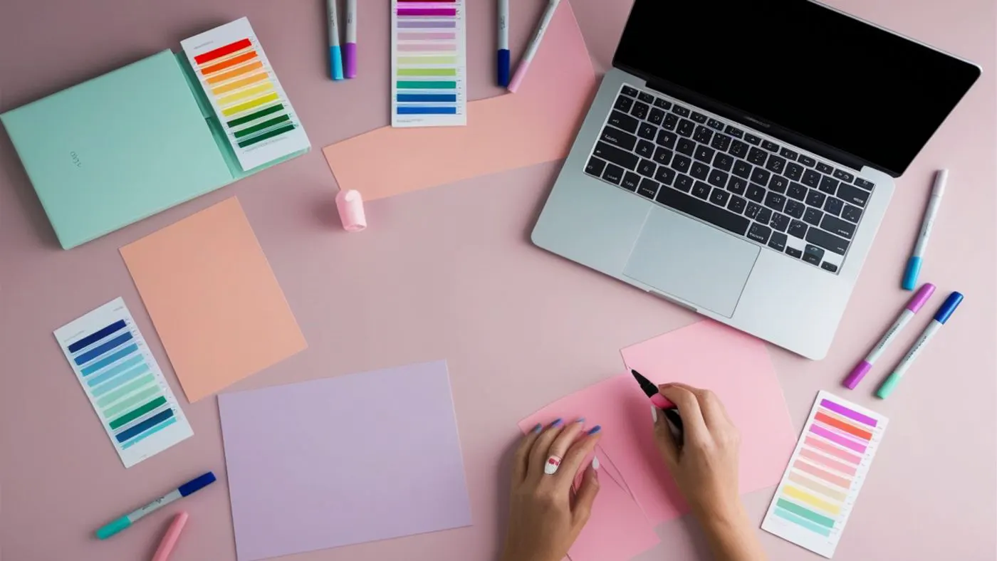
9) Soft Neutrals and Calm Palettes
Soft neutrals use warm whites, gentle grays, and muted pastel accents. This trend is trendy because it feels premium, calm, and trustworthy. Many brands want visuals that feel less aggressive and more refined. Calm palettes also work well with minimal layouts and clean product photography.
You can use soft neutrals for wellness brands, skincare, home goods, modern SaaS, and editorial storytelling. To create it easily, choose one neutral base and one accent color. Add a subtle texture or a gentle gradient for depth. Common mistakes include low contrast text that becomes hard to read. Another mistake is using neutrals without a focal point, making the design feel flat. Keep one strong anchor, such as dark text or a clear CTA button. Test contrast on mobile screens. When calm palettes stay readable, they look elegant and modern.

10) Bold Gradients and Digital Glow
Bold gradients use rich color transitions, soft glow edges, and modern lighting effects. This trend is trendy because it adds energy and depth to screens. It also feels futuristic, which many tech and entertainment brands want. In 2026, designers use gradients to create a strong atmosphere without heavy illustration.
You can use it in app promos, music visuals, gaming creatives, and hero banners. To do it easily, build gradients with three or four color stops. Add subtle grain to reduce banding, and keep typography simple. Common mistakes include using random rainbow blends that feel cheap. Another mistake is using glow effects everywhere, which becomes noisy. You should keep glow as an accent, not as a full layout. Use gradients behind key elements and keep the reading area clean. When glow supports focus and mood, the design feels premium.
11) Selective 3D Accents
Selective 3D uses one or two 3D elements instead of full 3D scenes. You might add a 3D icon, a simple shape, or a product mockup. This trend is trendy because it adds depth without a huge production cost. It also helps brands look modern while keeping layouts clean.
You can use selective 3D for hero sections, product ads, packaging previews, and UI marketing pages. To do it easily, keep the 3D form simple and use consistent lighting. Place it on a clean background, and add a soft shadow for grounding. Common mistakes include mismatched lighting between 3D and the rest of the design. Another mistake is heavy files that slow down page load. You should optimize images for the web and keep reflections under control. When 3D looks consistent and lightweight, it improves design without hurting performance.
12) Collage and Cut-and-Paste Layers
Collage design mixes photos, textures, stickers, and text blocks in layered compositions. This trend is trendy because it feels handmade and expressive. It also fits storytelling, which brands need in 2026. Collage can feel playful, bold, or emotional depending on your materials.
You can use collage for fashion campaigns, music posters, youth branding, and social content. To do it easily, start with one hero image and cut it out cleanly. Add two or three supporting layers, such as paper texture or tape shapes. Then place text in clear blocks with strong hierarchy. Common mistakes include using too many textures and losing focus. Another mistake is mixing cutout styles, such as sharp edges with torn edges, which feels inconsistent. Keep one dominant layer, keep spacing consistent, and keep the main message easy to read. When collage stays structured, it looks artistic, not chaotic.

13) Texture-First Design
Texture-first design uses grain, paper fibers, halftone dots, or fabric surfaces. This trend is trendy because it adds warmth and tactility. It also helps designs feel less “AI-smooth” and more human. In 2026, many brands use texture to create emotional depth without adding clutter.
You can use texture-first design in branding, posters, packaging, and editorial visuals. To create it easily, apply a light grain overlay at low opacity. Add paper texture behind large blocks, and keep text areas clean. Common mistakes include applying heavy texture everywhere, which makes colors muddy. Another mistake is using too many texture types in one layout. Keep your textures consistent across a campaign. Mask textures away from body text to maintain readability. When texture supports the mood and does not block the message, it makes the design feel premium and real.
14) Motion-First Brand Identity
Motion-first brand identity treats motion as part of the brand system. Logos animate, icons transition, and UI interactions carry the brand tone. This trend is trendy because brands now live on screens and video platforms. In 2026, motion creates memorability and helps people recognize a brand faster.
You can use motion branding in app onboarding, product promos, ads, and social templates. To do it easily, define two or three motion rules. Choose one easing style, one speed range, and one signature movement. Then apply them across your assets. Common mistakes include inconsistent timing and random animation styles. Another mistake is using long animations that slow the user experience. Keep motion short and purposeful. Test on mobile devices, and ensure performance stays smooth. When motion supports meaning and flow, the brand looks modern and polished.
15) Surreal Composites and Dream Scenes
Surreal composites mix real photos with impossible elements. You may show floating objects, giant products, or unusual skies. This trend is trendy because it breaks scroll fatigue and sparks curiosity. Brands use surreal visuals to tell stories and create emotion. In 2026, surreal design also helps campaigns feel fresh and cinematic.
You can use it in advertising, editorial covers, music visuals, and concept campaigns. To do it easily, start with a realistic base photo. Add one surreal element, then match lighting and perspective carefully. Use color grading to unify the scene, and add shadows where objects meet surfaces. Common mistakes include mismatched light direction and poor masking edges. Another mistake is ignoring scale and perspective, which makes the scene look fake. You should match grain and color temperature across all elements. When details feel consistent, surreal design looks believable and powerful.
16) Data-Style Visuals (Clean Information Design)
Data-style visuals use grids, numbers, charts, and modular blocks as design elements. This trend is trendy because people want clarity and proof. Brands also want trust, and data-based visuals feel credible. In 2026, many social posts and reports use this style to present ideas quickly. Many brands treat this as a key part of the top 20 graphic design trends 2026.
You can use it in pitch decks, dashboards, annual reports, and social “stat posts.” To do it easily, start with a strong grid and a clear type scale. Use one accent color for highlights, and keep the rest neutral. Common mistakes include decorative charts that hide the meaning. Another mistake is tiny labels that fail on mobile screens. Keep chart text readable, keep spacing generous, and use consistent units. You should never distort scales to look dramatic. When data stays honest and readable, this trend looks smart and professional.
17) Culture-Led and Local Visual Identity
Culture-led design uses local patterns, regional color moods, and authentic typography choices. This trend is trendy because global sameness feels boring. People respond better when the design feels rooted and specific. In 2026, brands also want community trust, so culture-led visuals support connection.
You can use it for tourism, food brands, local campaigns, and community events. To do it easily, research real references and use them respectfully. Choose patterns, imagery, and type that match the culture’s true style. If you use language elements, confirm spelling and typography rules. Common mistakes include stereotypes and token visuals. Another mistake is using cultural symbols without context, which can offend audiences. Keep the message clear and the layout structured. When culture adds meaning and respect, this trend creates strong identity and higher trust.
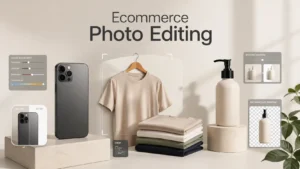
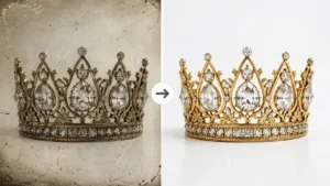
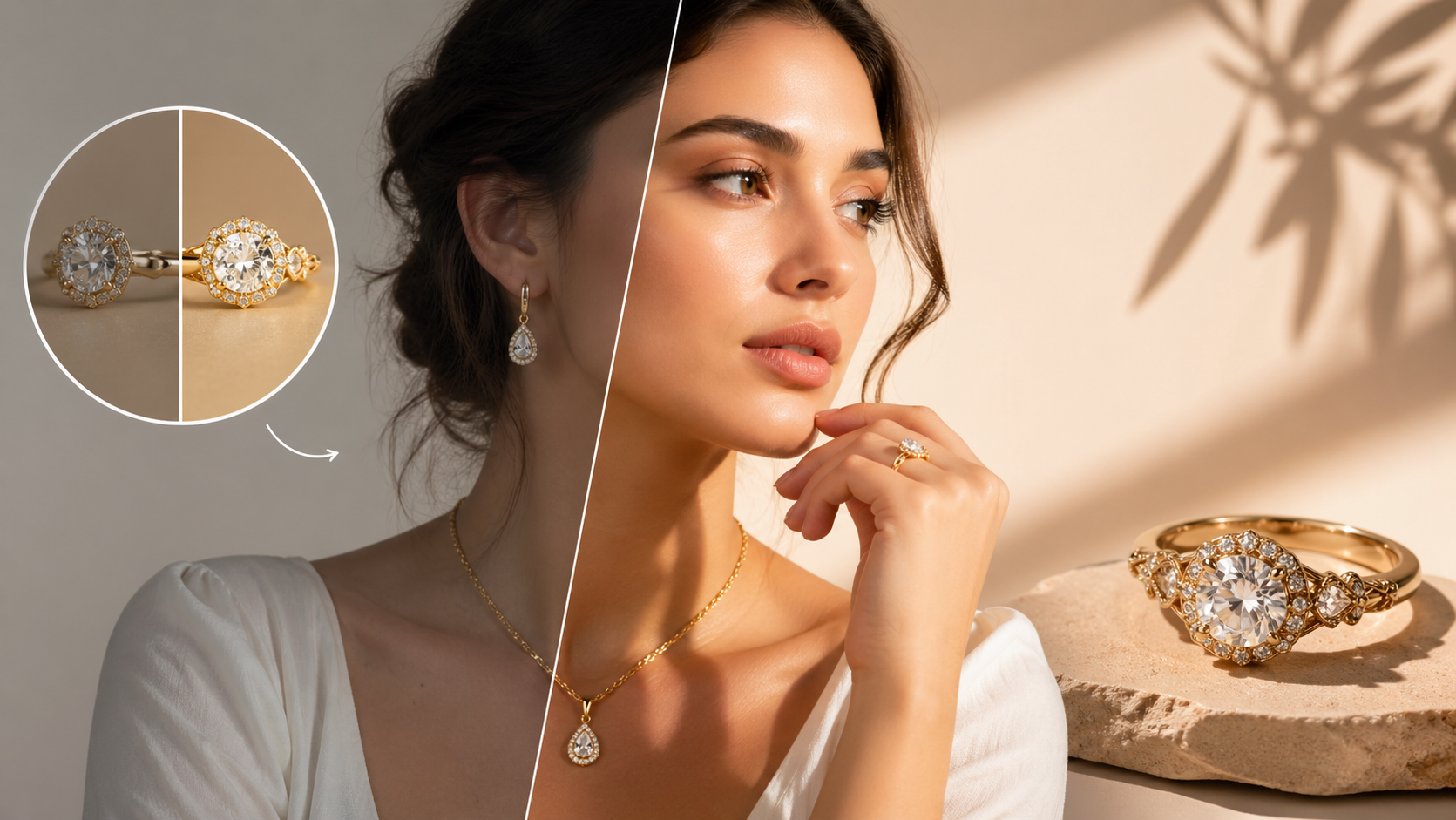
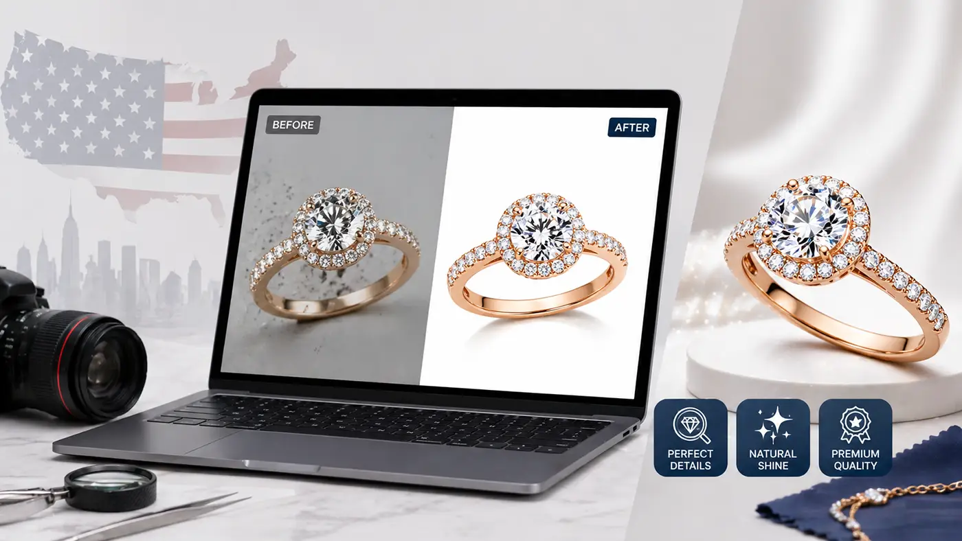
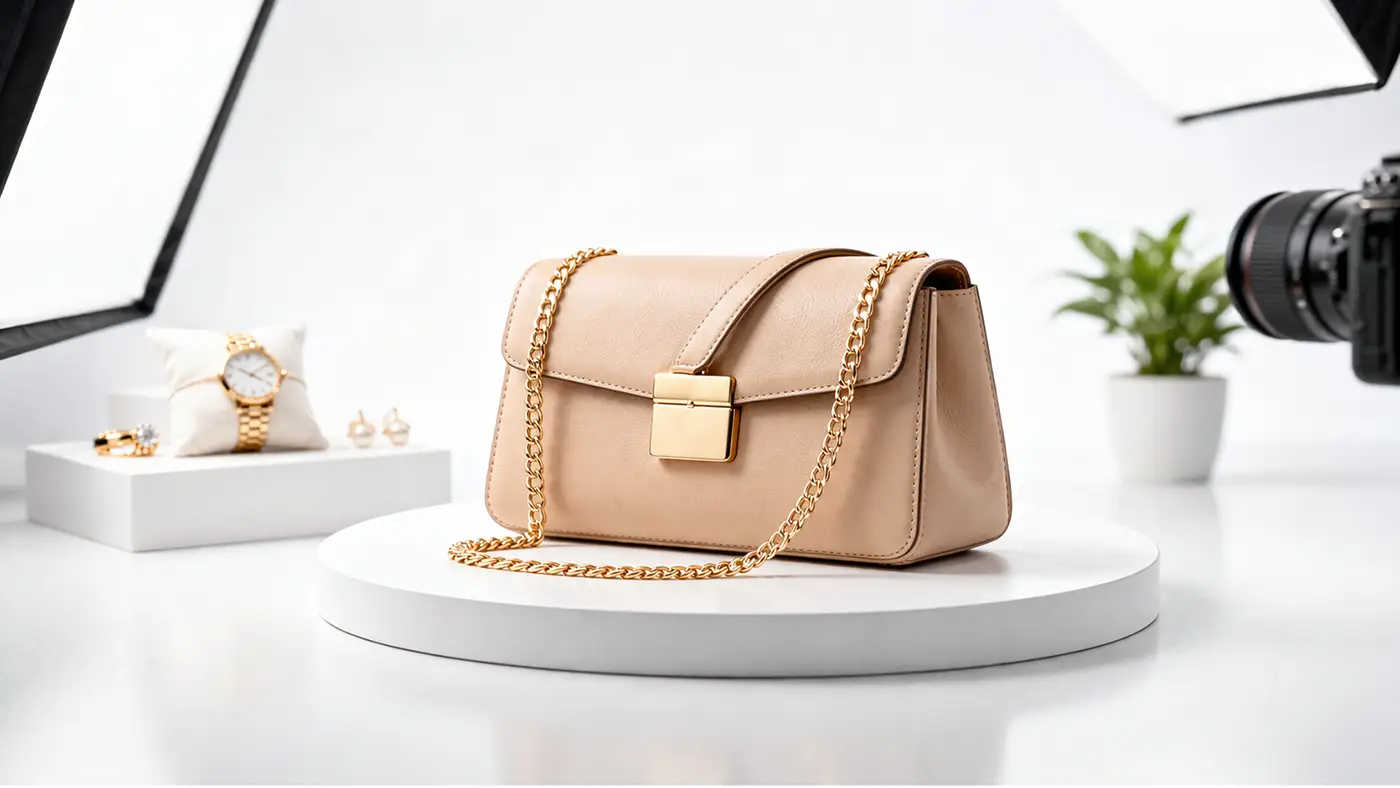
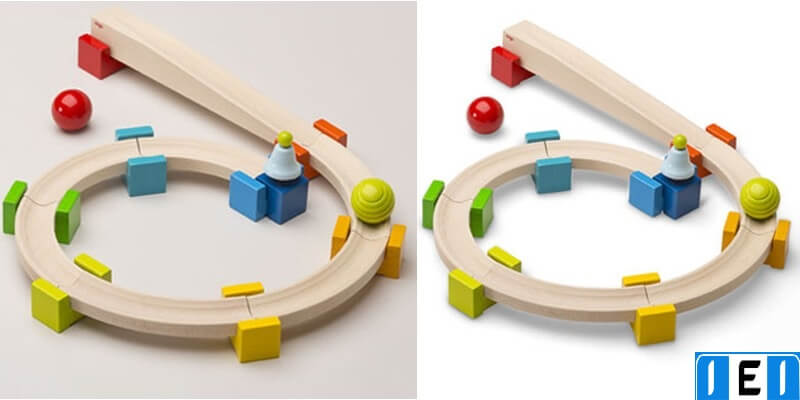
18) Premium Product Presentation for E-commerce
Premium product presentation focuses on clean cutouts, accurate color, controlled highlights, and consistent shadows. This trend is trendy because minimal layouts require perfect images. E-commerce also depends on trust, and clean visuals reduce doubt. In 2026, brands push harder for catalog consistency across marketplaces and ads.
You can use it for jewelry, fashion, electronics, and any product catalog. To do it easily, use a consistent background and correct white balance. Remove dust and scratches, fix wrinkles, and add realistic, natural shadows. Common mistakes include over-smoothing textures, which makes products look fake. Another mistake is the wrong color, which causes returns and complaints. Keep fine details visible, and keep shadows consistent across all items. If you offer image editing services, this trend connects directly to background removal, color correction, and shadow creation. When product images look consistent, the entire brand looks premium.
19) Modular Design Systems and Remixable Templates
Modular design uses repeatable components like cards, tiles, labels, and content blocks. This trend is trendy because it speeds up production while keeping brand consistency. Teams can create many assets quickly by remixing approved modules. In 2026, this matters because content volume keeps increasing.
You can use it for social templates, newsletters, landing pages, and UI marketing. To do it easily, build a small component library first. Define spacing rules, corner radius, font sizes, and color usage. Then remix modules without breaking the rules. Common mistakes include too many module styles, which creates visual chaos. Another mistake is inconsistent spacing, which makes layouts look unprofessional. Keep one spacing unit system and apply it everywhere. Maintain a clear reading order even when layouts look playful. When modules stay consistent, the system scales cleanly.
20) Accessibility-First Design
Accessibility-first design makes visuals readable for more people. It uses clear typography, strong contrast, good spacing, and inclusive choices. This trend is trendy because accessibility improves user experience for everyone. It also supports trust and brand quality. In 2026, accessible design becomes a standard expectation, not a bonus feature.
You can use it for websites, apps, social posts, presentations, and packaging information. To do it easily, choose legible fonts and keep the body text comfortable. Use strong color contrast, and avoid placing text on busy images without overlays. Common mistakes include pale text on light backgrounds and tiny captions. Another mistake is using color alone to show meaning, which fails for many viewers. Add labels, icons, and spacing to support color cues. Test your design on a phone and in grayscale. When accessibility improves clarity, the design also performs better.
Applying These 2026 Design Trends to Real Projects?
Reading about the top 20 graphic design trends 2026 is a great start, but results come from execution. Many 2026 trends depend on clean, consistent visuals. Even the best layout can look weak if the images are not polished. Small issues like wrong color tone, rough cutouts, uneven shadows, or low-quality product photos can reduce trust fast. That is why smart brands invest in professional editing before they launch new creatives. The photo graphic zone latest 2026 embraces human flaws, making design feel more real and relatable.
Image Expert helps you turn design ideas into ready-to-publish visuals. Expert designer support e-commerce brands, agencies, and creators who need high-quality outputs at scale. If your trend-based designs need product-ready images, their team can handle the heavy lifting. They can remove or replace backgrounds, create natural shadows, match colors across a catalog, and retouch images for a clean, premium look. They also help with clipping paths, ghost mannequin edits, jewelry retouching, and image optimization for web and marketplaces.
If you want your 2026 designs to look consistent across ads, websites, and social media, you can send us a few sample images. Expert graphic designer will review your needs and suggest the best editing workflow. This way, you get trend-ready graphics that look sharp, professional, and brand-consistent.
Conclusion
These top 20 graphic design trends 2026 show a clear direction. Designers want faster workflows, but they also want human warmth and real personality. Brands want systems that scale, and visuals that stay consistent across platforms. If you apply these trends with a clear hierarchy and simple structure, your designs will look modern and effective. If you also avoid common mistakes like low contrast, messy layering, and weak typography, your work will feel professional. Trends change, but clarity and consistency always win.