Color grading helps you turn simple footage into eye-catching visuals. You can use it for videos, social media, or product content. The right color grading tools can improve your colors and make your work look more professional.
You can adjust brightness, colors, and tones to create a better look. You can also use warm or cool colors to set the mood. In this guide, you will learn easy tips and simple techniques to improve your color grading and get clean, balanced results.
Difference Between Color Correction and Grading
Color correction and color grading are not the same. Color correction fixes the colors in an image or video. It makes the white look white and the colors look natural. Color grading comes after that. It changes the look and style of the image. You can make it warm, cool, bright, or dark. In simple words, color correction fixes the image, and color grading makes it look creative and attractive.
Why Color Grading Matters
Color grading is important because it makes your photos and videos look better and more attractive. It helps you set the mood, like warm, cool, bright, or dark. Good color grading also makes your content look more professional. It keeps your colors balanced and helps your work stand out. Color grading tools help you adjust colors, brightness, and tones easily.
Essential Tools for Color Grading
Software Options for Color Grading
The first step in effective is choosing the right color grading software. There are several options available, each with its own strengths and weaknesses.
Adobe Premiere Pro
Adobe Premiere Pro is a popular video editing software. Many professionals use it for editing and color grading. It has tools like Lumetri Color for easy color control. You can fix colors and create a cinematic look. This color grading tools works well for YouTube, films, and social media videos.
DaVinci Resolve
DaVinci Resolve is one of the best tools for color grading. It offers strong and advanced color tools. Many filmmakers use it for professional work. You can adjust colors with high accuracy. It also has a free version with powerful features.
Final Cut Pro
Final Cut Pro is a video editing tool for Mac users. It has a clean and simple interface. You can edit videos and adjust colors easily. It works fast and gives smooth performance. This color grading tools is great for beginners and professionals. It offers intuitive controls and seamless integration with other Apple color corrction software.
Adobe After Effects
Adobe After Effects is used for motion graphics and visual effects. It also has tools for color grading. You can create creative and cinematic looks. It works best when used with Premiere Pro. It is great for advanced video projects.
Filmora
Filmora is an easy video editing software for beginners. It has simple tools for color grading. You can apply filters and adjust colors quickly. It is good for YouTube and social media content. You do not need high skills to use this color grading tools.
Lightroom (for photos)
Lightroom is great for photo editing and color correction. It is easy to use and beginner-friendly. You can adjust light, color, and tone easily. It also supports presets for quick editing. It is perfect for photographers and content creators.
Photoshop
Photoshop is a powerful photo editing tool. It gives you full control over colors and details. You can use layers and advanced tools for editing. It is best for detailed and professional work. It is widely used by designers and editors.
Hardware for Accurate Color Grading
In addition to software, having the right hardware is crucial for achieving accurate color grading.
Monitors and Calibration Tools
A high-quality monitor that can display a wide range of colors is essential for accurate color grading. Additionally, calibrating your monitor ensures that the colors you see are true to life. Tools like the X-Rite i1Display Pro can help you maintain accurate color representation.
Graphics Cards and Processing Power
Color grading can be demanding on your computer, especially when working with high-resolution footage. A powerful graphics card and sufficient processing power are essential for smooth performance. This ensures that your software runs efficiently, allowing you to make real-time adjustments without lag.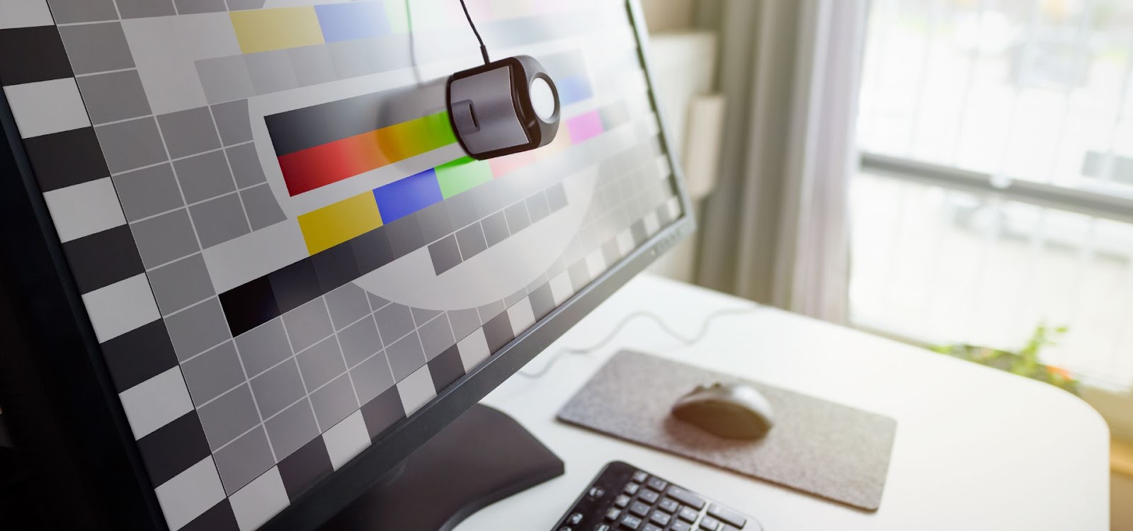
Fundamental Techniques in Color Grading
Balancing Colors
One of the first steps in color grading is balancing the colors in your footage.
White Balance Adjustment
Correcting white balance is crucial to ensure that whites appear white and colors are accurate. This involves adjusting the temperature and tint of your footage to remove any unwanted color casts.
RGB Parade and Waveform Monitor
Tools like the RGB Parade and Waveform Monitor can help you balance the colors in your footage. The RGB Parade displays the red, green, and blue channels separately, allowing you to see if any color is dominating the others. The Waveform Monitor, on the other hand, shows the brightness levels in your footage, helping you balance exposure.
Creating Mood with Colors
Once your footage is balanced, you can start using colors creatively to set the mood.
Warm vs. Cool Tones
Warm tones like reds, oranges, and yellows can create a cozy, inviting atmosphere, while cool tones like blues and greens can make a scene feel calm or eerie. By adjusting the overall color temperature, you can shift the mood of your scene to match the story you’re telling.
Saturation and Desaturation
Saturation refers to the intensity of colors in your footage. Increasing saturation can make your colors pop, while desaturation can give your footage a more muted, subdued look. Both techniques can be used creatively to enhance the mood of your scene.
Matching Shots for Consistency
Consistency is key in color grading, especially when working on projects with multiple scenes.
Scene-to-Scene Matching
Ensuring that colors are consistent from one shot to the next is crucial for maintaining continuity. This involves matching the color balance, exposure, and overall look of your shots so that they flow seamlessly together.
Using LUTs (Look-Up Tables)
LUTs are a powerful tool for achieving consistent color grading across multiple shots. They apply a preset color grade to your footage, allowing you to quickly achieve a specific look. However, it’s important to use LUTs carefully, as they can sometimes introduce unwanted color shifts.
Advanced Color Grading Techniques
Cinematic Color Grading
For those looking to achieve a cinematic look, there are several advanced techniques to explore.
Teal and Orange Look
The teal and orange look is a popular color grading technique in Hollywood films. It involves enhancing the teal tones in the shadows and the orange tones in the highlights, creating a high-contrast, visually striking image.
High Contrast and Vibrant Colors
Another cinematic technique involves increasing the contrast and vibrancy of your footage. This can make your images pop and create a more dynamic visual experience. However, it’s important to strike a balance to avoid making your footage look unnatural.
Working with Skin Tones
Skin tones are one of the most challenging aspects of color grading, as even slight changes can make a person look unnatural.
Preserving Natural Skin Tones
When grading skin tones, it’s important to keep them looking natural. This involves carefully adjusting the hue, saturation, and luminance of the skin tones to avoid making them look too red, green, or washed out.
Avoiding Unnatural Color Shifts
Unnatural color shifts can occur when applying LUTs or other creative grades. To avoid this, use tools like the vectorscope, which displays the hue and saturation of colors, to ensure that skin tones remain within a natural range.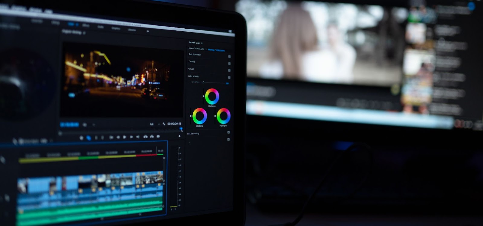
Creative Grading for Specific Genres
Different genres of film and video often require different color grading styles.
Horror and Thriller
For horror and thriller genres, dark, desaturated colors can enhance the eerie and suspenseful atmosphere. Cool tones, such as blues and greens, can make a scene feel cold and unsettling, perfect for creating tension.
Romantic Comedies
In contrast, romantic comedies often use warm, vibrant colors to create a lighthearted and joyful atmosphere. Saturated reds, pinks, and yellows can make the scenes feel more lively and cheerful, reflecting the upbeat tone of the genre.
Common Mistakes in Color Grading and Solution
Even with the best tools and techniques, it’s easy to make mistakes in color grading. Here are some common pitfalls to watch out for.
Over-Saturation
Over-saturating your footage can make it look unnatural and unpleasant to the eye. While it can be tempting to boost colors for a more vibrant look, it’s important to maintain a balance to avoid making your footage look cartoonish.
Inconsistent Grading
Inconsistent grading between shots can be jarring for the viewer and disrupt the flow of your video. Always check your work across different scenes to ensure that the color grading is consistent and seamless.
Ignoring the Importance of Skin Tones
As mentioned earlier, skin tones are critical in color grading. Ignoring them can result in footage that looks unnatural or unflattering. Always take the time to adjust skin tones carefully and avoid drastic changes that could detract from the overall quality of your work.
The Future of Color Grading
As technology advances, so too does the world of color grading. Here’s a look at what the future holds.
AI in Color Grading
Artificial intelligence is beginning to play a role in color grading, with AI-powered tools that can automatically apply color grades based on your preferences. While these tools are still in their infancy, they have the potential to revolutionize the field by making color grading faster and more accessible.
Trends in Visual Media and Their Impact on Grading Techniques
The trends in visual media are constantly evolving, and color grading techniques must evolve with them. From the rise of HDR (High Dynamic Range) content to the growing popularity of virtual reality, color graders will need to stay ahead of the curve to continue producing top-quality work.
Conclusion
Color grading is both an art and a science, requiring a blend of technical skill and creative vision. By mastering the techniques outlined in this guide, you can unlock the full potential of your visuals and create stunning, emotionally resonant work. Remember, practice makes perfect, so don’t be afraid to experiment and find your own unique style.
FAQs
What is the difference between color correction and color grading?
Color correction focuses on making colors look natural and consistent, while color grading is about stylizing colors to create a specific mood or tone.
Which software is best for beginners in color grading?
Adobe Premiere Pro and DaVinci Resolve are both excellent choices for beginners, with user-friendly interfaces and powerful tools.
How can I match skin tones across different scenes?
Use tools like the vectorscope to ensure skin tones remain consistent and within a natural range. Also, consider using LUTs to maintain consistency.
What is a LUT, and how do I use it in color grading?
A LUT (Look-Up Table) is a preset color grade that can be applied to your footage. It helps achieve a specific look quickly, but should be used carefully to avoid unwanted color shifts.
Can I achieve professional-level color grading without expensive equipment?
Yes, with the right software and a well-calibrated monitor, you can achieve high-quality color grading. While professional equipment can enhance the process, it’s not a strict requirement for great results.