
Colour correction is one of the most critical aspects of post-processing in photography. Whether you’re a seasoned professional or a budding enthusiast, mastering colour correction can elevate your images from ordinary to extraordinary. It’s the process that ensures your photos are visually appealing and true to the scene you originally captured. Accurate colour correction is especially vital when working on projects that require precision, such as product photography, where the colours must be exact, or portrait photography, where the skin tones need to be natural and flattering. This comprehensive guide will delve into the essentials of colour correction, equipping you with the tools and techniques you need to perfect your images.
The Fundamentals of Colour Correction
What is Colour Correction?
Colour correction is the practice of adjusting the colours in your photos to make them appear natural, balanced, and true to life. This process involves addressing various factors like white balance, exposure, and colour casts, ensuring that the colours in your images reflect reality as closely as possible. Whether you’re dealing with the cool blue tones of an overcast day or the warm hues of a sunset, colour correction helps in achieving a neutral look that can be further enhanced through creative adjustments.
Differentiating Colour Correction from Colour Grading
While both colour correction and colour grading are integral parts of post-processing, they serve different purposes. Colour correction is primarily focused on fixing any colour issues to create a natural-looking image. It’s about making sure that the whites are white, the blacks are black, and the colours are balanced. On the other hand, colour grading is where you can get creative. It’s about applying a specific mood or style to your image, whether it’s making it look vintage, cinematic, or giving it a particular colour tone. Colour correction is the foundation, while colour grading is the finishing touch that adds your unique flair to the image.
Why Colour Correction is Essential
The importance of colour correction in photography cannot be overstated. It’s a process that ensures your images are both visually appealing and technically accurate, providing a solid foundation for any further creative adjustments.
Achieving Natural and True-to-Life Colours
One of the primary goals of colour correction is to make your photos look as close to reality as possible. Whether you’re capturing the vibrant colours of a landscape or the subtle tones of a portrait, getting the colours right is crucial. Colour correction helps in eliminating any unwanted tints or casts that might have been introduced by the lighting conditions at the time of the shoot. By achieving true-to-life colours, your images will not only look more professional but will also resonate more deeply with viewers.
Enhancing Visual Appeal
Beyond accuracy, colour correction plays a significant role in enhancing the overall visual appeal of your photos. By carefully adjusting the colours, contrast, and exposure, you can make your images more striking and engaging. Colour correction allows you to bring out the best in your photos, making the colours more vibrant or creating a balanced, harmonious look. Whether you’re preparing your photos for print, display, or online sharing, proper colour correction will ensure they stand out and leave a lasting impression.
Tools and Software for Colour Correction
To achieve professional-grade colour correction, you need the right tools and software. With the proper setup, you can make precise adjustments that will take your photos to the next level.
Popular Photo Editing Software
There are several powerful software options available for colour correction, each offering a range of tools to help you perfect your images.
Adobe Lightroom
Adobe Lightroom is a go-to choice for many photographers due to its powerful colour correction capabilities. It provides an intuitive interface and a variety of tools that allow you to make precise adjustments. With Lightroom, you can easily correct white balance, adjust exposure, and fine-tune individual colours using the HSL (Hue, Saturation, Luminance) panel. Lightroom also allows you to apply these adjustments selectively, giving you complete control over how your image looks.
Adobe Photoshop
Adobe Photoshop offers even more advanced tools for colour correction, making it an ideal choice for photographers who need precise control over every aspect of their images. Photoshop’s Curves and Levels adjustments are particularly powerful, allowing you to make fine-tuned changes to the tonal range and colour balance of your images. Additionally, Photoshop offers the ability to work with masks and layers, enabling non-destructive editing and allowing you to experiment with different corrections before committing to a final look.
Capture One
Capture One is another excellent option, particularly known for its superior RAW image processing and colour correction tools. Capture One’s Colour Balance tool and Advanced Colour Editor provide photographers with highly detailed control over their images’ colour profile. This software is often favored by professional photographers for its ability to deliver high-quality results, especially when working with large volumes of images that require consistent colour correction.

Essential Hardware for Colour Accuracy
In addition to software, having the right hardware is crucial for achieving accurate colour correction. The best software in the world won’t help if your monitor isn’t showing you true colours.
Colour-Calibrated Monitors
A colour-calibrated monitor is a must-have for anyone serious about colour correction. Standard monitors often display colours inaccurately, leading to poor decisions during the editing process. A calibrated monitor, on the other hand, ensures that the colours you see on your screen are true to life, allowing you to make precise adjustments with confidence. Investing in a good-quality, colour-calibrated monitor can make a significant difference in the accuracy and quality of your final images.
Colour Calibration Tools
Even the best monitors need regular calibration to maintain their accuracy. Colour calibration tools like the X-Rite i1Display Pro or Datacolor SpyderX can help you keep your monitor’s colours accurate and consistent. These devices measure the colours displayed on your screen and adjust them to match industry-standard colour profiles. Regular calibration ensures that what you see on your screen is what you’ll get in print or on other devices, making it an essential part of any colour correction workflow.
Step-by-Step Guide to Colour Correction
Correcting the colours in your photos can seem daunting, but by following a step-by-step process, you can make the task more manageable and achieve professional results.
Assessing Your Image
Before you start making adjustments, it’s essential to take a step back and assess your image. Understanding what needs to be corrected will guide your editing process and help you make more informed decisions.
Identifying Colour Casts
One of the first things to look for when assessing your image is the presence of colour casts. Colour casts are unwanted tints that can affect the overall look of your photo, usually caused by the lighting conditions during the shoot. For instance, fluorescent lighting might give your image a greenish hue, while sunset lighting might introduce warm orange tones. Identifying these casts is the first step in correcting them, helping you restore the natural colours in your image.
Understanding Histograms
The histogram is a powerful tool that can help you assess the exposure and tonal balance of your image. It provides a visual representation of the brightness levels in your photo, showing you where the highlights, midtones, and shadows fall. By analyzing the histogram, you can identify areas that are underexposed or overexposed and make necessary adjustments to achieve a more balanced image. Understanding and using histograms effectively is crucial for precise colour correction and overall image enhancement.
Adjusting White Balance
White balance adjustment is one of the most critical steps in colour correction. It ensures that the colours in your image appear natural and consistent with the lighting conditions at the time of the shoot.
Using Eyedropper Tool
Most photo editing software includes an eyedropper tool that allows you to quickly and accurately set the white balance. By selecting a neutral grey or white area in your image with the eyedropper, the software automatically adjusts the white balance to eliminate any colour casts, ensuring that the colours are accurate. This tool is particularly useful in situations where the lighting conditions have introduced an unwanted tint to your image.
Manual White Balance Adjustments
In some cases, automatic white balance adjustments might not give you the results you want. Manual adjustments allow you to fine-tune the temperature and tint of your image until the colours look just right. By carefully adjusting these settings, you can correct any remaining colour casts and ensure that the overall tone of your image matches the mood you want to convey. Manual white balance adjustments give you more control and can be particularly useful in challenging lighting situations.
Balancing Exposure and Contrast
Exposure and contrast are key elements in colour correction that significantly affect the overall look and feel of your images. Properly balancing these aspects ensures that your photos are well-lit, detailed, and visually appealing.
Correcting Underexposed and Overexposed Areas
Underexposed areas in your image might appear too dark, losing detail, while overexposed areas might be too bright, washing out important details. To correct these issues, use the exposure slider in your editing software to brighten or darken specific areas of your image. The goal is to achieve a balanced exposure where all parts of the image are visible and properly illuminated, enhancing the overall clarity and quality of your photo.
Adjusting Contrast for Depth
Contrast adjustments can make your images more dynamic by enhancing the difference between the light and dark areas. Increasing contrast can add depth and dimension to your photo, making the subject stand out more clearly. However, be careful not to overdo it, as too much contrast can result in harsh transitions and loss of detail. Finding the right balance is key to achieving a natural and appealing look.
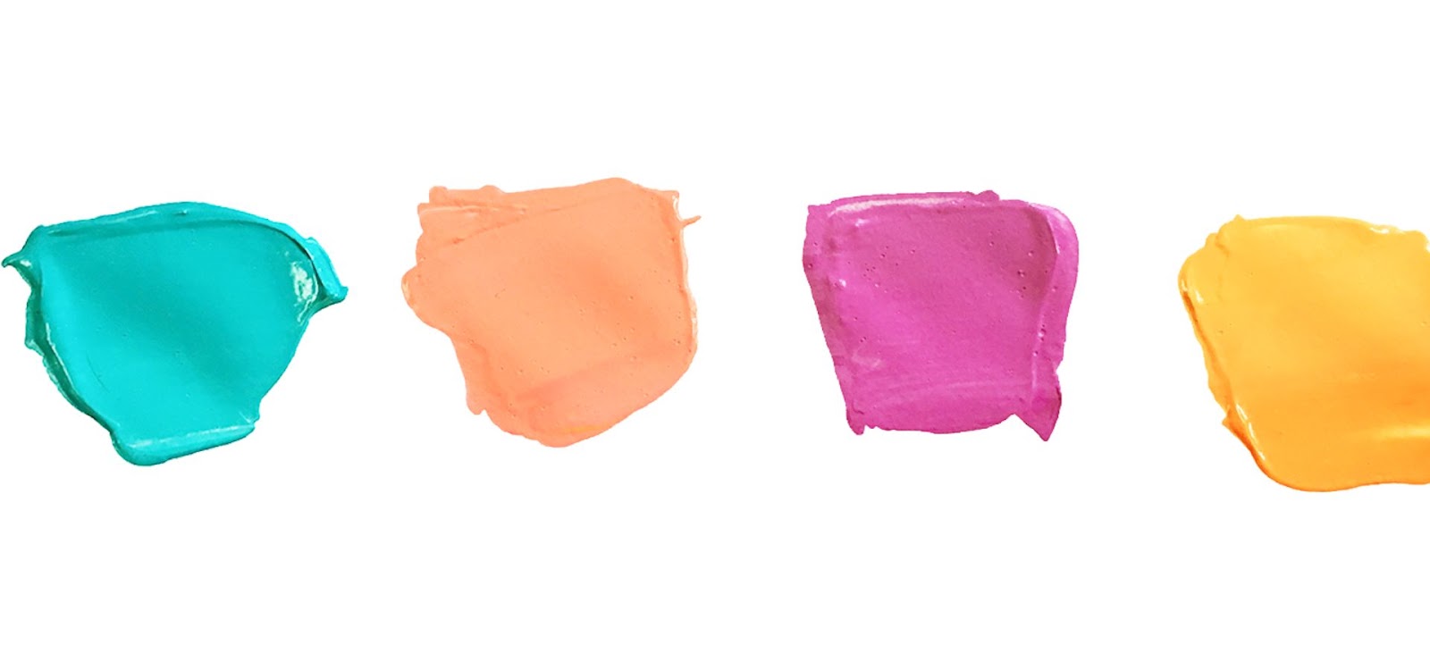
Fine-Tuning Saturation and Vibrance
Saturation and vibrance adjustments allow you to control the intensity of colours in your image, helping you achieve the desired look.
Enhancing Colours without Overdoing It
Saturation increases the intensity of all colours in your image, making them more vibrant, while vibrance specifically targets the more muted colours, leaving already saturated areas relatively untouched. This distinction makes vibrance a safer option for enhancing colours without the risk of over-saturation. When adjusting saturation and vibrance, aim for a natural look that enhances the colours without making them appear artificial or exaggerated.
Controlling Colour Intensity
When adjusting saturation and vibrance, it’s important to keep the overall balance of your image in mind. While boosting colours can make your photo more striking, too much intensity can lead to a garish, unnatural look. Use these tools with restraint, and always compare your adjustments to the original image to ensure you’re enhancing, not overwhelming, the natural beauty of the scene.
Applying Selective Colour Adjustments
Selective colour adjustments allow you to target specific colours in your image for more precise control, enabling you to make changes that affect only certain areas without altering the entire photo.
Targeting Specific Colours
This technique is particularly useful when you want to enhance or tone down certain colours without affecting the rest of the image. For example, you might want to make the blue sky more vibrant while keeping the other colours unchanged. Most editing software allows you to isolate specific colours and adjust their hue, saturation, and luminance independently, giving you the flexibility to refine your image exactly as you envision.
Enhancing Skin Tones
When working with portraits, it’s crucial to pay attention to skin tones. Subtle adjustments can make a significant difference in how natural and flattering the skin appears. Tools like the HSL panel or targeted colour adjustment brushes can help you achieve the perfect balance, ensuring skin tones look warm and natural without appearing overly red or yellow. This careful handling of skin tones is essential for creating professional-quality portraits that truly highlight the subject’s features.
Common Mistakes in Colour Correction
Even experienced photographers can make mistakes during the colour correction process. Being aware of these common pitfalls can help you avoid them and ensure your images look their best.
Over-Saturation
One of the most common mistakes in colour correction is over-saturating your image. While vibrant colours can be visually striking, pushing the saturation too far can make your photo look unnatural and cartoonish. The key is to find a balance where the colours are vivid but still realistic. When adjusting saturation, always step back and evaluate whether the changes enhance or detract from the natural beauty of your image.
Ignoring White Balance
Failing to correct the white balance can leave your image with an unwanted colour cast, making it look unprofessional. Always take the time to adjust the white balance, especially if you’re working in mixed lighting conditions. By addressing white balance early in your editing process, you’ll ensure that your colours are consistent and true to life, setting a solid foundation for further adjustments.
Overlooking the Importance of Skin Tones
In portrait photography, skin tones are one of the most important aspects of colour correction. Ignoring them or making drastic adjustments can result in unnatural-looking skin, which can be unflattering. Always prioritize getting the skin tones right, even if it means sacrificing some of the vibrancy in other areas of the image. Ensuring that your subjects look their best will make your portraits more engaging and professional.
Advanced Techniques for Colour Correction
Once you have a good grasp of the basics, you can explore more advanced colour correction techniques to refine your images further and achieve even more precise results.
Using Curves for Precise Adjustments
The Curves tool is one of the most powerful colour correction tools available, offering precise control over the tonal range of your image.
Adjusting RGB Channels Individually
With Curves, you can adjust the Red, Green, and Blue channels individually, allowing you to correct colour imbalances and create a custom look. For example, if your image has a green tint, you can adjust the Green channel to neutralize it. This level of control enables you to make subtle or significant changes to your image’s colour profile, helping you achieve exactly the look you want.
Creating S-Curves for Contrast
An S-Curve is a popular technique that enhances contrast by brightening the highlights and deepening the shadows. This adjustment can make your image more dynamic and visually appealing. By creating an S-Curve in the Curves tool, you can add depth and contrast to your photo, giving it a more polished and professional appearance.
Working with Colour Profiles
Colour profiles determine how colours are represented in your images. Understanding and using them correctly can significantly impact the final result, especially when printing or displaying your photos on different devices.
Understanding sRGB vs. Adobe RGB
sRGB and Adobe RGB are two of the most common colour profiles. sRGB is widely used and compatible with most devices, making it the default choice for online images and general use. Adobe RGB, on the other hand, offers a broader colour range, making it ideal for professional work, particularly when preparing images for print. Depending on your output medium, you should choose the profile that best suits your needs. Understanding the differences between these profiles is essential for ensuring that your images look their best, regardless of where they’re viewed.
Applying ICC Profiles
ICC profiles are used to ensure consistent colour reproduction across different devices, such as your camera, monitor, and printer. Applying the correct ICC profile can help you achieve more accurate and predictable colours, especially when printing your photos. Using ICC profiles is particularly important for professional photographers who need to ensure that their images look the same on every device and in print, avoiding any unpleasant surprises when the final product is produced.
The Role of Colour Correction in Different Photography Genres
Colour correction techniques can vary depending on the type of photography you’re working with. Here’s how to approach colour correction in different genres to achieve the best results.
Portrait Photography
Portraits require special attention to skin tones and subtle colour adjustments to enhance the subject’s features.
Preserving Natural Skin Tones
In portrait photography, the primary goal is to maintain natural and flattering skin tones. Avoid extreme adjustments that could alter the subject’s appearance, and focus on enhancing the skin’s warmth and texture. By carefully managing skin tones, you can create portraits that look natural and engaging, making your subjects feel comfortable and confident.
Enhancing Eye and Hair Colour
Subtle enhancements to eye and hair colour can make a portrait stand out. Use selective colour adjustments to add depth and vibrance, making these features more pronounced without looking artificial. By focusing on these details, you can create portraits that are not only visually striking but also more personal and expressive, capturing the essence of your subject.
Landscape Ph3otography
Landscape photography often involves capturing a wide range of colours, from vibrant skies to lush greenery.
Balancing Sky and Foreground Colours
When correcting landscape photos, it’s important to balance the colours between the sky and the foreground. This might involve enhancing the blues in the sky while ensuring that the greens and browns in the foreground are also well-represented. By achieving a harmonious balance, you can create landscapes that are visually cohesive and inviting, drawing viewers into the scene.
Enhancing Greens and Blues
Landscapes often feature prominent greens and blues. Enhancing these colours can make your images more vivid and bring out the natural beauty of the scene. However, be careful not to oversaturate, as this can make the image look unrealistic. Striking the right balance in your colour adjustments will help you create landscapes that are both true to life and visually stunning.
Product Photography
In product photography, colour accuracy is paramount. The goal is to represent the product as accurately as possible, making it look appealing to potential customers.
Achieving Accurate Colours
Product photography requires precise colour correction to ensure that the colours in your images match the actual product. This is especially important for online sales, where customers rely on photos to make purchasing decisions. By achieving accurate colours, you can build trust with your audience, ensuring that what they see is what they get, leading to higher satisfaction and fewer returns.
Highlighting Product Details
Selective colour adjustments can help highlight specific details of a product, such as the texture or finish. By enhancing certain colours, you can draw attention to the key features that make the product stand out. This level of detail can make your product photos more compelling, increasing the likelihood of attracting potential buyers and boosting your sales.
Conclusion
Colour correction is an essential skill for any photographer, whether you’re a beginner or a professional. By mastering the techniques outlined in this guide, you can ensure that your images are not only technically sound but also visually stunning. Remember, the key to successful colour correction is practice and attention to detail. The more you work on your images, the more intuitive these processes will become, allowing you to create photos that truly reflect your vision. So, the next time you sit down to edit your photos, take your time with colour correction, and watch as your images come to life with vibrant, accurate colours.
FAQs
What is the difference between colour correction and colour grading?
Colour correction focuses on making colours look natural and consistent, while colour grading is about stylizing colours to create a specific mood or tone.
Which software is best for colour correction in photography?
Adobe Lightroom, Adobe Photoshop, and Capture One are all excellent choices for colour correction, each offering a range of powerful tools for photographers.
How can I correct skin tones in my photos?
Use tools like the HSL panel or selective colour adjustments to fine-tune skin tones. Focus on keeping the skin tones natural and flattering, avoiding extreme colour shifts.
Is it necessary to use a colour-calibrated monitor?
Yes, a colour-calibrated monitor is essential for accurate colour correction. It ensures that the colours you see on your screen are true to life, which is crucial for producing high-quality images.
Can I automate the colour correction process?
While some software offers automated colour correction tools, it’s often better to make manual adjustments to ensure accuracy. Automated tools can be helpful as a starting point, but manual fine-tuning is usually required for the best results.