
Color grading is an essential part of the post-production process in photography. It’s the secret sauce that can turn a good photo into a stunning one, giving it the look and feel that perfectly matches your creative vision. When it comes to dynamic photography, bright color grading can make your images pop, adding vibrancy and energy that draws the viewer’s eye. But what exactly is bright color grading, and how can you achieve radiant results? Let’s dive in.
Understanding Dynamic Photography
Dynamic photography is all about capturing movement, energy, and life. Whether it’s a bustling city street or a dramatic landscape, dynamic photography thrives on action and intensity. This genre benefits immensely from bright color grading, which enhances the vibrancy and dynamism of the image, making it more engaging and visually appealing.
The Science Behind Color Grading
Color grading is not just about adjusting the colors of an image; it’s about understanding color theory and how different hues interact with each other. Bright color grading involves boosting the luminosity and saturation of colors to make them more vivid. By enhancing the colors in this way, you can create images that are visually impactful and emotionally resonant.
Essential Tools for Bright Color Grading
To achieve the best results, you need the right tools. Several software options are available for color grading, with Adobe Lightroom, Photoshop, and DaVinci Resolve being among the most popular. Each of these programs offers robust tools for adjusting color, contrast, and brightness. Additionally, investing in a high-quality monitor and color calibration hardware will ensure that your edits are accurate and true to life.
Preparing Your Images for Color Grading
Before you start color grading, it’s crucial to prepare your images correctly. Always shoot in RAW format to retain as much detail as possible. Start by making basic adjustments to exposure, white balance, and contrast. These pre-grading steps lay the foundation for more detailed color work later on.
Step-by-Step Guide to Bright Color Grading
Analyzing the Image
Begin by taking a close look at your image. Identify the areas that need enhancement and consider the overall mood you want to create.
Adjusting Basic Parameters
Start with the basics: adjust exposure, contrast, and white balance to correct any issues and set the stage for color grading.
Enhancing Colors with Curves and Levels
Use curves and levels to adjust the tonal range of your image, bringing out the brightness and deepening shadows for a more dynamic look.
Fine-Tuning with Selective Color Adjustments
Selective color adjustments allow you to tweak specific colors in your image. This is where you can really make your reds more vibrant, your blues deeper, and your greens more lush.
Adding Vibrance and Saturation
Finally, boost the vibrance and saturation to make your colors pop. Be careful not to overdo it, as too much saturation can make an image look unnatural.
Advanced Techniques for Radiant Results
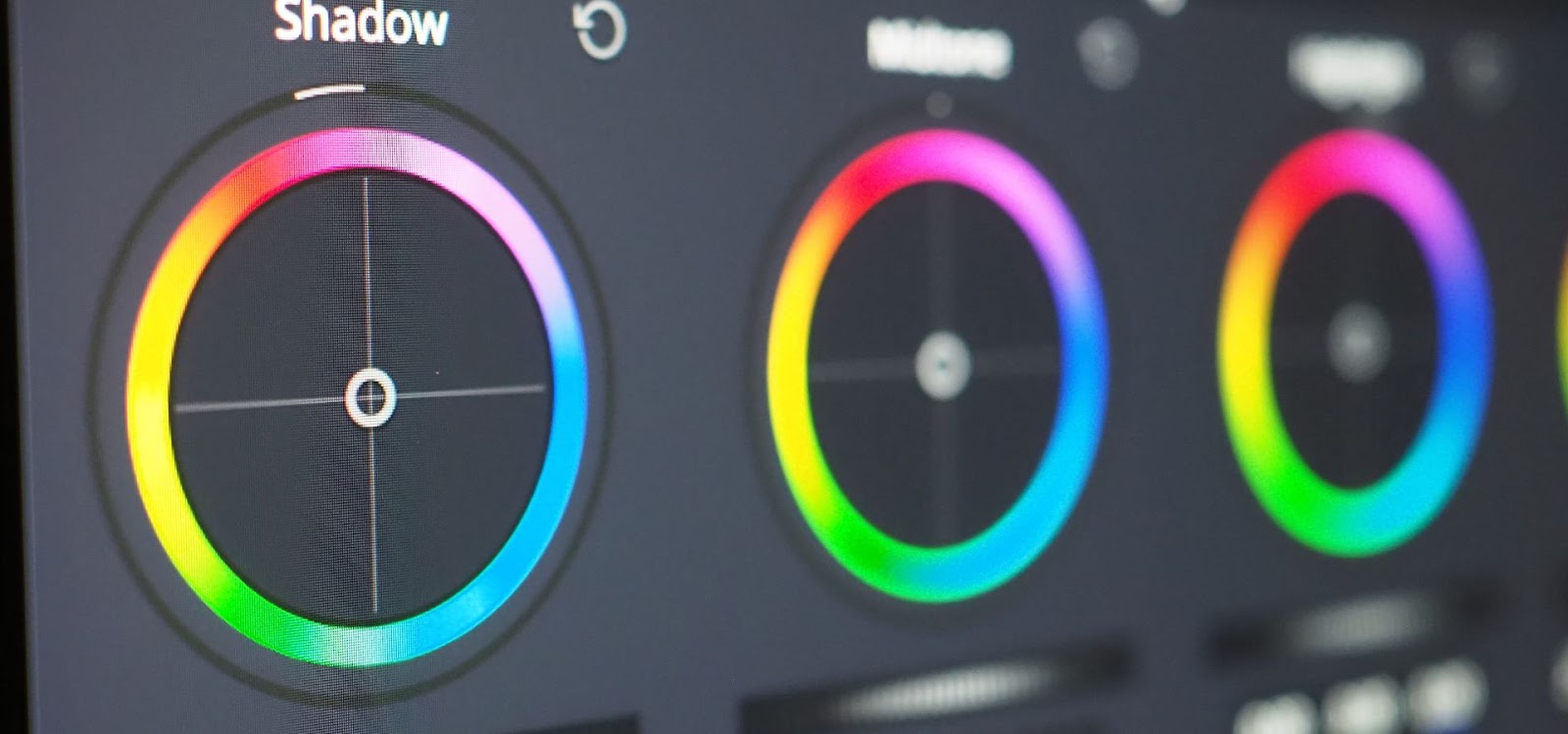
Using HSL (Hue, Saturation, Lightness) Adjustments
The HSL panel is a powerful tool that lets you control the intensity and tone of individual colors. Use it to create precise adjustments that enhance the overall look of your image.
Color Grading with LUTs (Look-Up Tables)
LUTs are pre-set color grading profiles that can give your images a consistent look. They’re great for achieving a particular style quickly and can be customized to suit your needs.
Applying Gradient Maps for a Unique Look
Gradient maps allow you to apply a gradient of colors across your image, creating a unique and stylized effect. Experiment with different gradients to find a look that complements your photo.
Common Mistakes in Bright Color Grading and How to Avoid Them
Over-Saturation
It’s easy to get carried away with saturation, but too much can ruin an image. Keep an eye on your colors and pull back if they start to look too intense.
Clipping Highlights and Shadows
Bright color grading can sometimes lead to clipped highlights or shadows, where details are lost. Use the histogram to monitor your tonal range and adjust accordingly.
Ignoring Skin Tones
When working with portraits, it’s essential to maintain natural-looking skin tones. Over-saturating or altering skin tones too much can make your subject look unnatural.
Incorporating Bright Color Grading in Different Genres of Photography
Bright color grading isn’t just a one-size-fits-all approach; it can be tailored to fit various photography genres, each with its own unique requirements and creative possibilities. Let’s explore how bright color grading can be effectively used across different genres to elevate your images.
Portrait Photography
In portrait photography, the focus is on the subject, and bright color grading can help make your subject stand out. The key is to enhance the natural tones of the skin while making sure the colors of the clothing, background, and environment complement the subject. For example, you can increase the vibrancy of the background while maintaining natural skin tones to create a striking contrast that draws attention to the person in the frame. Additionally, subtle enhancements to eye color and hair highlights can add an extra layer of depth and interest to your portraits.
Tips:
- Use selective color adjustments to enhance the vibrancy of the background without affecting the skin tones.
- Consider using a soft light to illuminate the subject’s face, which can then be enhanced with bright color grading to create a warm and inviting portrait.
Landscape Photography
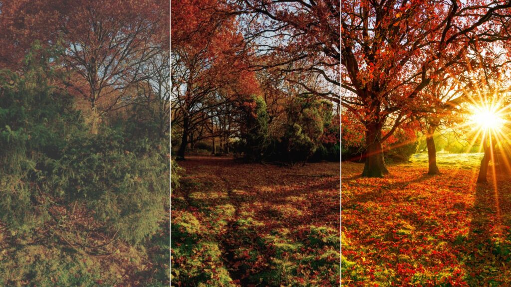
Landscape photography is all about capturing the beauty of nature, and bright color grading can transform a scene into something truly breathtaking. By enhancing the greens of the foliage, the blues of the sky, and the warm tones of sunlight, you can create a vivid and dynamic image that captures the essence of the landscape. Bright color grading can also be used to emphasize the natural contrasts in the scene, such as the contrast between the sky and the land, or between different types of vegetation.
Tips:
- Use HSL adjustments to individually enhance the colors of different elements in the landscape, such as the sky, trees, and water.
- Apply gradient filters to enhance the depth of the sky and bring out the rich tones of the landscape.
Urban and Street Photography
Urban and street photography often captures the energy and vibrancy of city life, and bright color grading can bring these scenes to life. By enhancing the colors of buildings, street art, signage, and even the people within the frame, you can create a visually striking image that reflects the dynamism of urban environments. Bright color grading can also be used to highlight specific elements within the scene, such as the vibrant colors of a mural or the reflective surfaces of skyscrapers.
Tips:
- Use selective color adjustments to draw attention to specific elements in the scene, such as a bright red car or a colorful storefront.
- Experiment with increasing contrast to add depth and dimension to the urban environment.
Nature and Wildlife Photography
Nature and wildlife photography can benefit greatly from bright color grading, especially when it comes to showcasing the vivid colors found in nature. Whether it’s the bright feathers of a bird, the lush greens of a forest, or the warm hues of a sunset, bright color grading can make these elements stand out. By enhancing the natural colors of the scene, you can create images that are both visually stunning and true to life.
Tips:
- Focus on enhancing the natural colors of your subject without making them appear unnatural or overly saturated.
- Use color grading to bring out the textures and details in the wildlife, such as the patterns on a bird’s feathers or the scales of a reptile.
Fashion Photography
Fashion photography thrives on bold and vibrant colors, making it a perfect genre for bright color grading. By enhancing the colors of clothing, accessories, and makeup, you can create a powerful visual impact that highlights the design and style of the fashion. Bright color grading can also help to create a specific mood or atmosphere, such as a warm, summery feel for a beachwear shoot or a cool, modern look for a high-fashion editorial.
Tips:
- Pay close attention to the color palette of the clothing and accessories, and use color grading to enhance these elements without clashing.
- Experiment with different levels of vibrance and saturation to create a bold and striking look.
Product Photography
In product photography, the goal is to showcase the product in the best possible light, and bright color grading can help achieve this. By enhancing the colors of the product, you can make it appear more appealing and eye-catching. Bright color grading can also be used to ensure that the product stands out against the background, making it the focal point of the image.
Tips:
- Use selective color adjustments to enhance the colors of the product while keeping the background more neutral.
- Consider using color grading to create a specific mood or atmosphere that complements the product, such as a warm tone for a luxury item or a cool tone for a tech gadget.
Event Photography
Event photography often involves capturing a wide range of scenes, from intimate moments to large-scale celebrations. Bright color grading can help bring out the energy and emotion of these events by enhancing the colors of the setting, the decorations, and the people. Whether you’re photographing a wedding, a concert, or a festival, bright color grading can add a layer of vibrancy that makes the images more memorable.
Tips:
- Use color grading to enhance the mood of the event, such as warm tones for a wedding or bold, vibrant colors for a concert.
- Pay attention to the lighting conditions and use color grading to compensate for any harsh or uneven lighting.
Architectural Photography
In architectural photography, bright color grading can be used to emphasize the design and structure of buildings. By enhancing the colors of the materials, the lighting, and the surrounding environment, you can create a striking image that highlights the architectural features of the building. Bright color grading can also be used to create a specific mood, such as a warm, inviting feel for a residential building or a cool, modern look for a commercial structure.
Tips:
- Use color grading to enhance the natural colors of the materials, such as the warmth of wood or the coolness of metal.
- Experiment with different levels of contrast and saturation to highlight the architectural details.
By understanding how bright color grading can be applied across different genres of photography, you can tailor your approach to suit each specific genre, creating images that are not only visually stunning but also perfectly aligned with your creative vision.
How Bright Color Grading Affects the Mood of Your Images
Color plays a significant role in setting the mood of a photograph. Bright color grading can evoke feelings of joy, excitement, and energy. By carefully choosing and enhancing specific colors, you can create an emotional impact that resonates with your audience.
Case Studies: Before and After Bright Color Grading
Portrait Photography
A portrait that initially looks flat can be transformed with bright color grading, making the subject stand out against a more vibrant background.
Landscape Photography
A dull landscape photo can become a breathtaking scene with the right color adjustments, bringing out the natural beauty of the environment.
Street Photography
Bright color grading can turn a simple street scene into a visually striking image, highlighting the vibrancy of urban life.
Tips for Consistency in Bright Color Grading
Consistency is key to developing a recognizable style. Save your settings as presets to maintain a cohesive look across different projects. Experiment with different styles, but always keep your unique vision at the forefront.
The Role of Calibration in Accurate Color Grading
Color accuracy is crucial in bright color grading. Calibrating your monitor ensures that the colors you see on screen are true to life. Use calibration tools to adjust your monitor’s color profile, ensuring consistent results across devices.
Exporting Your Final Image for Various Platforms
When exporting your images, consider the platform where they’ll be displayed. Images for the web should be optimized for screen viewing, while those for print need to be prepared with color profiles that suit the printing process.
Conclusion
Mastering bright color grading takes practice, but the results are well worth the effort. By enhancing the colors in your dynamic photography, you can create images that are not only visually stunning but also emotionally compelling. So, grab your camera, shoot in RAW, and start experimenting with bright color grading to find your unique style.
FAQs
What is the best software for bright color grading?
Adobe Lightroom and Photoshop are popular choices for bright color grading, offering powerful tools for adjusting colors and tones.
How do I avoid over-saturating my images?
Monitor your saturation levels carefully and use vibrance adjustments to increase color intensity without overdoing it.
Can I use bright color grading for black and white photography?
While bright color grading is typically used for color images, you can still apply similar techniques to enhance contrast and tonal range in black and white photos.
How does bright color grading affect skin tones?
When working with portraits, it’s essential to maintain natural-looking skin tones. Avoid excessive saturation or unnatural color shifts.
Is it necessary to use a calibrated monitor for color grading?
Yes, a calibrated monitor ensures that the colors you see on screen are accurate, leading to better results in your final images.